

PVSAT
graphic results
meten=weten
| |
|
||||||
|
PVSAT
graphic results |
meten=weten |
index | |||||
|
|
|
||||||||||||||||||||||||||||||||||||||||||||||||||||
| 1 2 | >>> |
Op deze pagina worden sommige belangrijke resultaten gepresenteerd van het PVSAT-2 project, deels in relatie met de eigen metingen m.b.v. het OK485 data interface (directe uitlezing van de OK4E omvormers), voor de zonnige 28e februari 2005 (zie ook dagcurves met andere systeemvariabelen op de web pagina dagcurves_28feb05.htm). Deze pagina wordt verder in de Engelse taal gepresenteerd om de informatievoorziening ook voor buitenlandse PVSAT gebruikers en andere geïnteresseerden toegankelijker te maken.
On this page some important results are given for the PVSAT-2 project, in part in close harmony with my own measurements with the OK485 data interface (direct readings from the OK4E inverters), for sunny February 28 2005 (see for other system parameters the day graphs given on web page dagcurves_28feb05.htm). This page is further presented to you in the English language to facilitate the understanding for foreign PVSAT users and other interested people.
Actual
measured power versus calculated average power
(OK485
5 minute logging interval versus PVSAT WEB'log light/Meteocontrol
data per quarter of an hour)
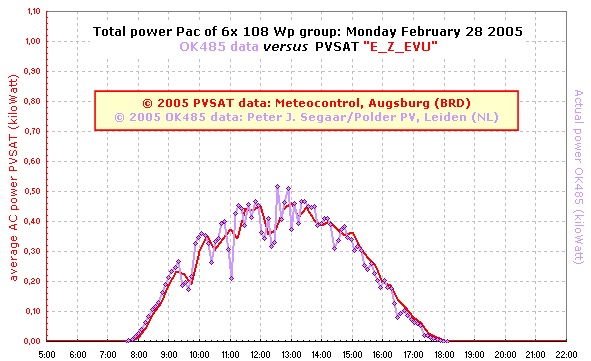
© 2005 Peter J. Segaar/Polder PV, Leiden (NL)
Both Y-axis with same range. Graph made from 2 data sources:
Calculated average AC power for each quarter of an hour
<ROLLOVER image>© 2005 Peter J. Segaar/Polder PV, Leiden (NL)
Red:
PVSAT WEB'log light. Graph with background grid obtained from
Meteocontrol's server in Augsburg. Purple:
OK485 data calculated from energy meter readings (OK4E inverters) in
logfile. Data superimposed on graph for PVSAT data.
Holding the mouse pointer over the graph gives the original time axis
data from the OK485 logfile (ranging from 6 to 7 minutes intervals);
dragging the mouse pointer away from the graph shows data with OK485
time axis optimized to that of PVSAT graph; hence, datapoints closest
to PVSAT datapoints were selected.
(Note: disable pop-up and/or page dynamics blockers
in your web browser to view this option!)
Another conclusion is that apparently there is no loss in power between the electronics in the inverters responsible for the data reading (the inverters are located on top of the building complex, with a 25 meter long AC cable to our appartment), and the PVSAT/WEB'log light data (readings from the end of the AC power cable, before feeding into the net).
Small variations between the two curves in the last graph (rollover image) are most probably the result of:
It is expected that, with fast changing light conditions (strong wind combined with sun and small clouds), the 2 curves will match less well because of the mentioned aberrations. However, if a cloudless sunny day without contrails is logged, it is expected that these 2 curves will match perfectly. A nice compliment for the PVSAT developers, as well as for the OK4 inverter inventor and brilliant software developer Henk Oldenkamp if this prediction will turn out to be true!
Quarterly energy yield of several Dutch PV-systems
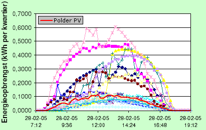
© March 2005 PVSAT Nieuwsbrief nr. 1/Organisatie voor Duurzame Energie (with kind permission from Corry de Keizer); overlay of Meteocontrol logging data for enhancement data Polder PV (red) by Peter Segaar/Polder PV.
Graph showing quarterly energy yield curves of 18 different PV-systems in the Netherlands obtained from Meteocontrol data extracted from WEB'logs. Since very different sizes of the PV-systems monitored are included in this graph (e.g., 648 Wp for Polder PV, 4400 Wp for the system depicted with a light pink line), energy yields vary considerably; also, systems with different orientations, shading, etc. are included.
Visualizing weather and solar flux changes with graphs obtained through PVSAT (November 15 2005)
Collecting the stuff: After the data from the WEB'log light have been automatically uploaded to the German Meteocontrol server, the PV owner is able to download the graphs on a daily basis from that server (visiting the website and logging in with one's private data), which are calculated "on-the-spot". Hence, because it is relatively easy to obtain these average power graphs, one is able to reconstruct the dynamic behaviour of the solar influx through time if one compares the downloaded graphs in a matrix with a sequence of days. Off course, with the caution that one should be able to detect eventual defects in the PV-system. In fact, the latter was one of the goals of the PVSAT-2 project: to be able to decipher PV-system defects or malfunctioning in the mountain of data and within the "normal" fluctuations that occur with the daily and seasonally fluctuating solar energy influx. The last two PVSAT newsletters (available through O.D.E.) provide more details of these interesting fault finding procedures and give nice examples of "typical" aberrations of the normal situation, such as partial shading, snow cover, etc.
Making graphic overviews: To show the normal fluctuations on a daily basis, I used a small trick. I collected all the downloaded graphs on my computer and stored each month in a separate folder. The bitmap (bmp) images generated by the Meteocontrol server are rather large (243 kB) and it is a rather laborious task to make all these graphs smaller to such an extent that a lot of them "fit" on the computer screen. However, when using the browsing option of an image handling program like Paint Shop Pro, one can easily get the same result, with a highly acceptable resolution if one does not put to many day graphs onto the screen. By browsing a "month folder", as I did for October 2005, all the day graphs appear in a single field, or one can make a selection in a separate folder and show the results. By applying the "Alt" and "Print screen" keys at the same time, one is able to make a screendump of the day graph configuration one is interested in, and "dump" the resulting image directly in the same program. After that, it takes one's own phantasy to edit the resulting image. I did this by cutting out "strips" with 4 day graphs each, and importing them into a table in the web page you are reading at this very moment:
©
November 2005 Peter J. Segaar/Polder PV Leiden (NL) images generated by the Meteocontrol PVSAT-2 server in Germany |
|||
 |
|||
| October
5 |
October
6 |
October
7 |
October 8 |
 |
|||
| October
9 |
October
10 |
October
11 |
October 12 |
 |
|||
| October
13 |
October
14 |
October
15 |
October 16 |
 |
|||
| October
17 |
October
18 |
October
19 |
October 20 |
 |
|||
| October
21 |
October
22 |
October
23 |
October 24 |
^^^
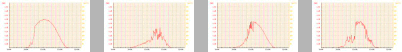
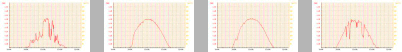
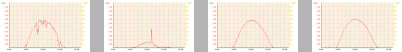
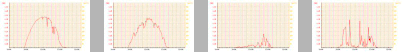
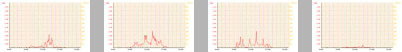
Average power (logging interval fixed at 5 minutes) as measured by
the WEB'log light
from the PVSAT-2 project field testing phase, in the day sequence
October 5-24, 2005.
Measurements are done on a part of the renovated PV-system
of Polder PV
(May 30-31 2005), consisting of 2 108 Wp and 4 93 Wp Shell Solar ACN
modules
(total nominal power monitored by the WEB'log: 588 Wp),
each fitted with a single
100 Watt OK4E inverter. The inverters have been mounted inside the
house during the renovation
commanded by the supplier of the PV-system.
Y-axis max. is 500 Watt (average AC-power per 5 minutes).
Power output on cloudless sunny October days (e.g., Oct. 16 in present
example) typically
starts around 8h30 and cumulates at app. 350 Watts average AC power
at 13h00 MEZT.
For the 588 Wp monitored that results in an average max. nominal power
of 0,6 W/Wp,
which is higher for the 108 Wp panels and lower for the 93 Wp panels.
If there are reflecting clouds around the sun, average AC power at
midday can rise to 380 Watts (Oct. 17).
AC power output on cloudless October days grinds to a halt around
18h30 daylight saving time, MEZT.
The most notable weather conditions visualized in this graph:
This collection of graphs gives a very nice view of the range of weather types that we encounter on a regular basis in the autumn on the west coast of the Netherlands, and shows the effects on the light conditions that are the result of this dynamic weather pattern. Nicely made "available" through the download option of the Meteocontrol server in Germany. Thank you very much for making this testing phase possible for civilians with solar panels!!!
Visualizing snow cover with PVSAT data (download March 6 2006)
On the "official" PVSAT website the proceedings of the project are available. In the contribution of Van Sark and De Keizer (Copernicus Institute, NL) a very interesting graph can be found of our PV-system, covered for a few days with a surprising pack of snow in the early, very cold days of March 2005. From their account the following graph:
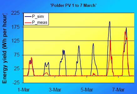
Red
line:
energy yield measured with the WEB'log light; dark
blue line: potential energy yield
simulated
on
basis
of system parameters and measured irradiation data (Meteosat).
Snow
cover starting on March 2 and ending on March 7, with differential
snow
melt from the individual solar panels (6x 10⁸ Wp) as of March 6 (2005).
© W.G.J.H.M. van Sark, A.C. de Keizer,
Utrecht University, the Netherlands
Copernicus Institute for Sustainable Development and Innovation
Dept. Science, Technology and Society
(from
p. 15 of: http://www.pvsat.de/WSBarcelona_testphase_UUSTS.pdf)
| 1 2 | >>> |
|
